Just installed...
 Jun 28, 2006, 11:25 AM
#1
Evolving Member
Thread Starter
iTrader: (1)

Join Date: Feb 2005
Posts: 209
Likes: 0
Received 0 Likes
on
0 Posts
Just installed...
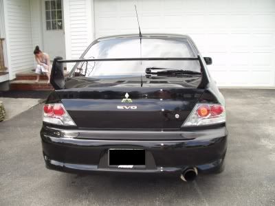
My UK rear trunk badge...that I got from ebay.
The quality is actually pretty good and I only paid $30, it also came with a stencil to apply the badge properly but I went ahead and did it my own way anyway....
The quality is actually pretty good and I only paid $30, it also came with a stencil to apply the badge properly but I went ahead and did it my own way anyway....


 Jun 28, 2006, 11:41 AM
#6
Evolving Member
Thread Starter
iTrader: (1)
Join Date: Feb 2005
Posts: 209
Likes: 0
Received 0 Likes
on
0 Posts
Originally Posted by jfLip
Ehh no offense but it looks sloppy. Some of the letters look crooked and I personally think the letters are too far apart... but you had the ***** to do that.
Jun 28, 2006, 11:43 AM
#7
Evolved Member
iTrader: (2)

Join Date: Oct 2005
Location: VA
Posts: 555
Likes: 0
Received 0 Likes
on
0 Posts
Originally Posted by CeeNiK
hehe at that point when the picture was taken the letters were still a little loose incase i had to do any adjusting...they are pretty straight now.

Trending Topics
Jun 28, 2006, 11:46 AM
#9
Evolved Member

Join Date: Sep 2005
Location: City O Sin, MA...the not so sinish part though...
Posts: 712
Likes: 0
Received 0 Likes
on
0 Posts
damn you, i was very close to doing the same thing. I went through a number of different evolution VII combos including that one, finally i settled on this...
with the VIII above the shifter
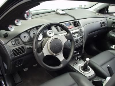
with the VIII above the shifter
Jun 28, 2006, 11:51 AM
#10
Evolved Member
iTrader: (26)
Join Date: Aug 2005
Location: Newport News, Virginia
Posts: 3,897
Likes: 0
Received 1 Like
on
1 Post
Originally Posted by LetItBreath
damn you, i was very close to doing the same thing. I went through a number of different evolution VII combos including that one, finally i settled on this...
with the VIII above the shifter
with the VIII above the shifter
Jun 28, 2006, 11:54 AM
#11
E V O L U T I O N has 9 letters, hence the 5th letter is the middle, which is the letter 'U', which should be centered on the  badge. I would ditch the VIII there on the lower-right as well...and yeah a lot of those letters are crooked but if you fixed them kudos. Other than that looks great
Jun 28, 2006, 12:01 PM
#14
Originally Posted by LetItBreath
no he has it right, the U should be slightly to the right to make up for the I being shorter on the right side.